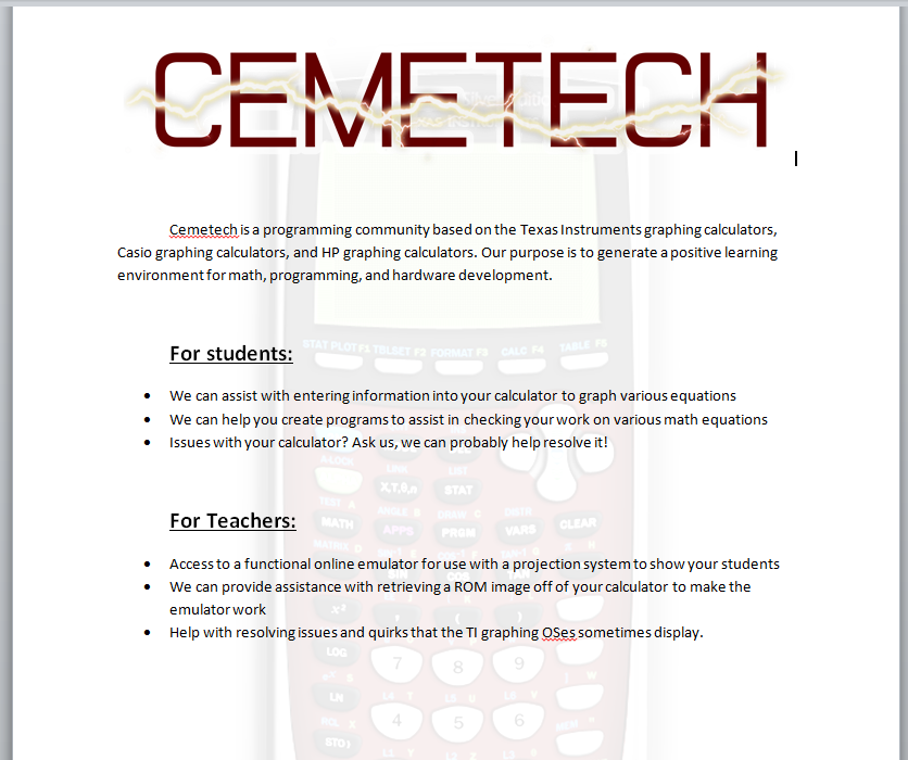
Hello Cemetechians! We're working on getting a flier setup to help direct students and educators to Cemetech for help and for them to have access to tools that we offer. This flier will be passed out via students to teachers (or teachers that visit us already to post up) in their class rooms or to be spread around at Maker Faire in the future.
What we need are more ideas to help sway educators and students on why they should join Cemetech. So post up any pro suggestions you might have, and we'll take it under consideration.

This seems great! When this is done, I might print up a few and hang them up in some of the high school math classes.
wow! this looks great!
the only things that i would recommend are:
-change the font to a larger font (18pt) and a nicer font (Helvetica)
-change "We can assist" to "Get assistance with" and change "We can help you create programs" to "Get help with creating programs" etc.
I'm definitely going to put this up in my math class at school once it's done!
Well, we are hoping for MORE points to add to the list so we don't need larger font. :p
And before you could hang them up, we hope you get permission from your teachers before doing so! We don't want anyone to get in trouble because of these!
As to the other changes, we'll take them under advisement

Cooler font!

Capitalize the first letter in "students"
or
Uncapitalize the first letter in "Teachers"
Other than that I think it looks pretty smexy
Okay, more points:
- Could be applicable to students or teachers: We can help you learn electronics, including how you can work with the Arduino, Raspberry Pi, and even robots.
- Teachers: We can help you learn how to write programs for calculators or computers to enrich your math, science, and other lessons.
- Teachers: Online TI-BASIC editor (SourceCoder) to help you write programs. (You already covered jsTIfied)
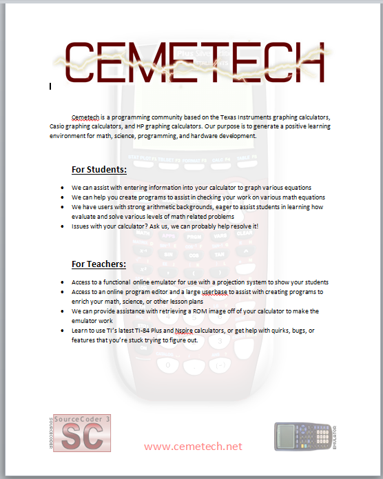
- Teachers: (I think we should rephrase the TI-OS statement to be far more broad:) Learn to use TI's latest TI-84 Plus and TI-Nspire calculators, or get help with quirks, bugs, or features that you're stuck trying to figure out.
I have a few:
-Teachers: We can help you learn to effectively use your calculator and teach students about the calculator.
-Students: We can help you resolve issues without the help of a teacher.
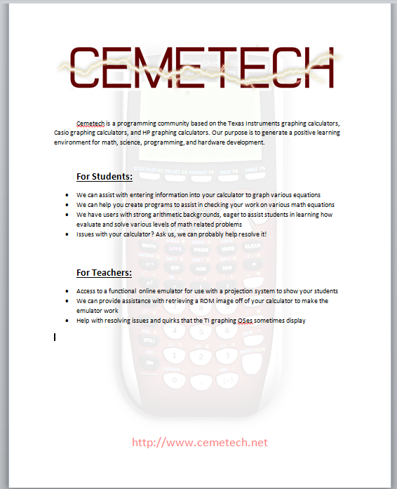
If the first screenie is all that's on the page, how about giving the cemetech.net url?
Ideas from IRC:
- Bullet about programming possibly doesn't stand out enough.
- Add in a point about coding unrelated to calcs. A lot of advanced projects for programming on PCs, working with dev boards, and designing other custom PCBs are here.
AHelper: Yes, I agree about emphasizing that we teach programming in general, like embedded electronics, Python/C/C++/Java (ugh), and so on. I also like the idea of mentioning in some way that we're a place to show off cool projects, especially to students. Yes, we definitely need the URL, and I also suggested little tiny KermBooks at the bottom.

123outerme: Good ideas there too, especially somehow getting across that we can help you figure out problems with your calculator or how to do something with it, even if your teacher is not available or doesn't know the answer.
Add more about general programming in the students section, currently you only mention math
Alright, I've not had a chance to properly reply to all of your posts yet, kind of busy for a short while, but here's an updated version of the document. The url was there before Ahelper said anything, I added it after the last time Kerm and I were working on it.

I fixed the capitalization on students, that's the only modification that's been done so far.
I'll be looking at your all suggestions later today.
I feel like
http:// is rather redundant. It helps in browsers and computer programs because it signifies the start of a URL but people hardly ever type in
http:// when going to a website unless they want the
https:// version. I feel the same way about the
www. as well but then the URL would be a little off-center, so I vote to keep at least that.
comicIDIOT wrote:
I feel like
http:// is rather redundant. It helps in browsers and computer programs because it signifies the start of a URL but people hardly ever type in
http:// when going to a website unless they want the
https:// version. I feel the same way about the
www. as well but then the URL would be a little off-center, so I vote to keep at least that.
haha, I agree about the http://
But my mom always types that part in...

Pretty sure the imagery for the footer is not something that will stay. Also can't get the text to move up to be more center with the images, which is irritating.
The text definitely needs to be bigger and maybe change the font to something that catches your eye. My favourite font is advantage but anything that really pops would do. The titles to the bullet points shouldn't be tabbed over like the bullets, they should be at the start of the line (sorry if that's confusing I can show you if you need me to). The pictures in the bottom corners don't really need to be there. Maybe make the bullets a different shape? Like a diamond or something? And colouring the bullets would be cool too. Definitely needs more "Cemetech" colours (like the red and yellow and stuff in the logo).
Stupid red squigglies... Add them to dictionary! Cemetech is definitely a word
APotato wrote:
Stupid red squigglies... Add them to dictionary! Cemetech is definitely a word
I did that XD
I've made a little prototype to kinda see what you were going for and I feel like what you're doing here is trying to put a lot of information in a tiny space. Unless you're going for a 9" x 12" poster, you need to summarize your points and keep it as basic as possible along with keeping it intriguing. The more points you add, the more they have to read and people being inherently lazy (myself included) the last thing you want is for them to get halfway through the poster and be like "wow, boring." Making the margins as narrow as possible will help with the space problem and allow you to easily make the text bigger and easier to read.
It's weird how I know this stuff. I seriously didn't think I'd be helping with this when I took that microcomputer applications class.
Here's my latest work. It has way too many words on it, but I think it has all the points we want to get across, it has the books, and it has bullets taken from Chauron's work.


Haha Kerm! You thief!!
No seriously though I like how that looks! The points and the paragraph at the beginning does need a bit of summarizing though. And the paragraph at the bottom would look better between the books and have one of the books flipped. The paragraphs look better centered in my honest opinion. Maybe put the website link under the book area like a footnote?
I like the fonts for the headings, what about the normal text?
Register to Join the Conversation
Have your own thoughts to add to this or any other topic? Want to ask a question, offer a suggestion, share your own programs and projects, upload a file to the file archives, get help with calculator and computer programming, or simply chat with like-minded coders and tech and calculator enthusiasts via the site-wide AJAX SAX widget? Registration for a free Cemetech account only takes a minute.
»
Go to Registration page
You cannot post new topics in this forum
You cannot reply to topics in this forum
You cannot edit your posts in this forum
You cannot delete your posts in this forum
You cannot vote in polls in this forum
