PT_ wrote:
mr womp womp wrote:
Maybe this is related to the changes you've been making to the archives, but the archive contributions section of everyone's profiles is blank...

Yes, you're right about that, that changed 
Oh, I'm dumb, that's intentional 
PT_ wrote:
Yes, you're right about that, that changed

So... are you guys just going to ignore the horrible wording and confusion caused by doing this? I mean, the goal is to make things better, not ten times worse.
Saying "File archives contributions are shown in that section." makes absolutely zero sense and is grammatically incorrect.
Pray tell, what would you prefer?
"File archives contributions are shown in the file archives"? Seems redundant.
"Look elsewhere for file archives contributions"???
Tari wrote:
Pray tell, what would you prefer?
"View author's archive contributions"
MateoConLechuga wrote:
Tari wrote:
Pray tell, what would you prefer?
"View author's archive contributions"
MateoC brought up an excellent point on IRC: was there a discussion of renaming the "Archives" section to "Downloads" (in more than just the navbar link and URL component)?
KermMartian wrote:
MateoConLechuga wrote:
Tari wrote:
Pray tell, what would you prefer?
"View author's archive contributions"
MateoC brought up an excellent point on IRC: was there a discussion of renaming the "Archives" section to "Downloads" (in more than just the navbar link and URL component)?
The general consensus was that "Downloads" was friendlier to the average internet passerby, and since the distinction between the two terms was so little, it made sense to change it. This topic is the reason it changed names in the first place, but there was no conversation there about adapting the rest of the site's terminology to suit it.
I can continue referring to my note that I'm not trying to make huge functional changes right now, but here's what the feature requests bug looks like at the moment:

There's some bandwidth to think about these now that I've migrated the old system out.
Something that I noticed- downloads are displayed for each version of the file at the top of the preview page, meaning that it will be shown as 357 on the main archives page, and then something like 0 on the local page (using HailStorm as an example). This is because the "downloads" on a file's page corresponds to that version's number of downloads. I think that it would be better if we had two separate categories- total downloads and version downloads, both of which would be displayed at the top of a file's page. Total would clearly be across all versions, while version would be only for that version of the file.
Looks good though, it seems like it would be easier to use for newcomers, and I like the versions feature.
Since I also missed that post and it came across to me like you were looking for suggestions, here are some!
- There is so much text here! No user genuinely wants to read all this!
- make the rating (ex. 10/10) larger, maybe coloring it from a muted green to a muted red (or putting some other kind of instantaneous visual indicator there, like what there was before but like... bigger than 3 pixels)
- based purely what I look at when I download a file, the metadata shouldn't be closer to the downloads button than the statistics.
- the downloads button is kinda jarring- I explain why a little later. Make it taller, less ugly, and less surrounded by stuff I don't care about.
- if they get nothing else from this, do note that the page feels like it has no structure. To be redundant, it feels cluttered, the information presented seems to have no obvious hierarchy.
- this leads to feelings of clutteredness- the goal is not to fit everything in to one view but to organize the information and make it accessible and useful
On the other hand, a lot of things are being done really awesomely, like the fact that all this information is being presented in the first place.
Amazon's purchase pages clearly do a lot of stuff right. Let's use their site as a case study, since it has similar motivations at a shallow level. (We want people to click the "yes please" button and have a good experience by some metric)
For one, the information on the Amazon page is clearly grouped into structures that are intuitive. There are sections clearly for "this is where we are in the amazon rainforest directory", "this is some general information on what you are looking at and who made it", "this is how you can buy this", "this is detailed information about this item if you need that to inform yourself". The download demo for Cemetech kinda does this, but it's pretty weak.
The Amazon site sticks to a clear color theme too. White for a background, blue for navigation things, and orange for accents. Introducing a green button to a very red site is quite jarring.
Overall, I think a lot of things are being done well besides this part.
I agree with iPhoenix regarding the last post.
I've also found an issue regarding the version control: when you upload a new version of a file that has a different file name than the last version, it will show up as a completely new entry in the program list. This isn't good for people like me, who like to name the folder something like "ProgCE1.0.0", changing the version number for each new upload. This can be seen here
here, where the new version of HailStorm that I uploaded yesterday is shown as a different file than version 2.0.0.
That's because you've made a new VFS entry for each version, which I guess was your point:

(I've gone ahead and made it so there's only one, HailStormCE.zip.)
A filename applies to all versions of a file, not just the one you provide it for.
The whole filename/title distinction is pretty useless; that should be improved soonish, since I've got workable ideas for the whole "categories not directories" idea and may just decide to only show file titles and never VFS filenames.
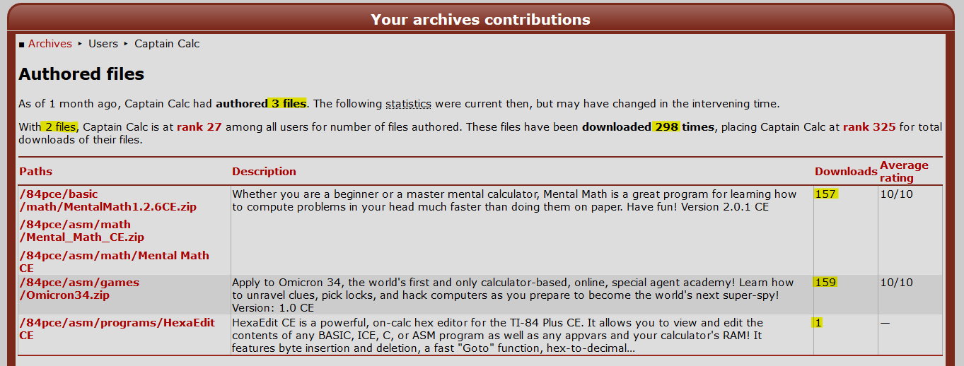
I've noticed that the total downloads number given at the top of a user's file contributions pages does not corresponded to the sum of the downloads for each of the user's files. The two numbers stating the author's total number of files also differs.

The warning that the statistics may have changed in the intervening time does not seem to explain the difference between the total number of authored files since it looks like they should have been recorded at the same time.
Are these bugs or are they results of a back-end process of which I am not aware?
I noticed Captain Calc's issue as well, and I believe that the issue is that the archives have not updated the statistics in some time. It even says "as of 1 month ago..." Are the archives on some sort of automatic update loop, or do they have to be manually updated? If the second is true, could they please be updated more regularly?
I think there should be a star rating system in place.

instead of clicking a link to a new tab. user/guest should be able to see all the contributions on the selected user's page. (just to make it simple for the users/guest). it should only display names of programs and rating

other than that the Archive/Download is looking good.
Working on the rating system is a known area for improvement.
Reimplementing archives handling in the legacy backend is sufficiently complex that it won't be done. On a sufficiently long timescale that data will be integrated though.
Slight necro-bump
I noticed that on the
Authored files page in this section:
Quote:
With 10 files, mr womp womp is at
rank 19 among all users for number of files authored. These files have been downloaded 7323 times, placing mr womp womp at
rank 69 for total downloads of their files.
The two hyperlinks (rank 19 and rank 69) both link to the same page which is the total downloads leaderboard. This makes sense for the "rank 68", but not so much for the "rank 19". I don't know if there is a page for a number of files authored leaderboard, but I would expect "rank 19" to lead to such a page.
epsilon5 wrote:
I noticed Captain Calc's issue as well, and I believe that the issue is that the archives have not updated the statistics in some time. It even says "as of 1 month ago..." Are the archives on some sort of automatic update loop, or do they have to be manually updated? If the second is true, could they please be updated more regularly?
I didn't notice this comment before; they're automatically updated, so either the timestamp is not being updated correctly or it's failing to recompute old statistics. I'll look into it.
Expanding the archive contents tab seems to move the file metadata tab downwards to align the lower border. I'd argue that 1) this movement should be avoided because of the principle of least surprise (I'd suggest to align the top and not the bottom), and 2) I don't think the expanding element is necessary (I'd suggest having it expanded by default, or simply permanently expanded with no option to hide it). Edit, see response below: Yes, you are completely right, should have read that first.
Tari wrote:
epsilon5 wrote:
I noticed Captain Calc's issue as well, and I believe that the issue is that the archives have not updated the statistics in some time. It even says "as of 1 month ago..." Are the archives on some sort of automatic update loop, or do they have to be manually updated? If the second is true, could they please be updated more regularly?
I didn't notice this comment before; they're automatically updated, so either the timestamp is not being updated correctly or it's failing to recompute old statistics. I'll look into it.
mr womp womp wrote:
The two hyperlinks (rank 19 and rank 69) both link to the same page which is the total downloads leaderboard. This makes sense for the "rank 68", but not so much for the "rank 19". I don't know if there is a page for a number of files authored leaderboard, but I would expect "rank 19" to lead to such a page.
These were at one point separate pages. The links could set the sort order to the given ranking though.
Nik wrote:
Expanding the archive contents tab seems to move the file metadata tab downwards to align the lower border. I'd argue that 1) this movement should be avoided because of the principle of least surprise (I'd suggest to align the top and not the bottom), and 2) I don't think the expanding element is necessary (I'd suggest having it expanded by default, or simply permanently expanded with no option to hide it).
See earlier discussion.


