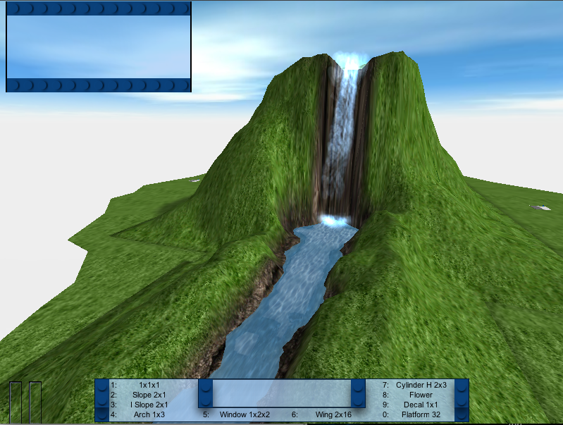
| What color should the inventory and chat hud be? |
| Green (current) |
|
7% |
[ 1 ] |
| Grey |
|
21% |
[ 3 ] |
| Blue |
|
71% |
[ 10 ] |
| light purple |
|
0% |
[ 0 ] |
|
| Total Votes : 14 |
|
I'm dissapointed with the GUI .
Looks bad in my opinion, and the brick preview system is only annoying me.

Any changes coming in the future ?
If not, How do i make a GUI?
Poll added. ~elfprince13
Derp wrote:
I'm dissapointed with the GUI .
Looks bad in my opinion, and the brick preview system is only annoying me.

Any changes coming in the future ?
If not, How do i make a GUI?
Well, "looks bad" isn't nearly enough information to fix the things you think look bad. What's wrong with the brick previews? what in particular do you dislike?
well, The green color is just ugly and the text lineup is horrible.
The TBM GUI would be nice.
Is it possible to get it?
And the preview, its hard to see which block its showing , and the picture quality is really bad.
first time i played it , it took me a moment to realize it was showing the 1x1 brick .
i suggest that it should be a spinning , high quality model in a separate window , and you could turn it off in the options
Think it like youre watching the Earth from outer space and you see it spin .
Derp wrote:
well, The green color is just ugly and the text lineup is horrible.
The TBM GUI would be nice.
Is it possible to get it?
And the preview, its hard to see which block its showing , and the picture quality is really bad.
first time i played it , it took me a moment to realize it was showing the 1x1 brick .
i suggest that it should be a spinning , high quality model in a separate window , and you could turn it off in the options
Think it like youre watching the Earth from outer space and you see it spin .
I made it. If you don't like green, what color would you like?
I can recolor it in seconds.
Plus, I think a Light Version similar to TBM's would be nice.
Black or gray. or very dark blue

I am going to whip up something soon. I don't really know what, but I agree that the HUD needs a makeover.
Thanks guys

Derp wrote:
Black or gray. or very dark blue

http://www.mediafire.com/file/jmtmh0q3oi0/HUD.zip
There is a grey and blue in there, along with other colors for the HUD.
If those suit, i'll do a black, if not, tell me what you'd like me to improve.
I like the grey one a lot more than the current green one, in the second style with the studs in the whole background. The neutral color is much better than the green imho.
hmm, I'm partial to the blue myself. Lets turn this into a poll.
I like blue, but I think you should throw in 6 or 8 basic color skins, with an extensible method of changing them similar to TBM's skins. Or perhaps have it come with just the one skin(if you're really that tight on space) but have the system in place so users can download the other skins if they want a different one and easily switch between all their downloaded skins.
if theres a mod download system coming ingame there should be a interface download thingy too
DShiznit wrote:
I like blue, but I think you should throw in 6 or 8 basic color skins, with an extensible method of changing them similar to TBM's skins. Or perhaps have it come with just the one skin(if you're really that tight on space) but have the system in place so users can download the other skins if they want a different one and easily switch between all their downloaded skins.
We actually totally scrapped the skin system  but it's not that hard to override GUI profiles.
Yea, no more skinning system. People can make mods if they really want to change the skins. To be honest though, we are probably going to redo the HUD if and when we redo the build selection system.
well i changed mine to blue, so if people know how to, then they shouldn't care... and if they don't know how... there should be a button in the special op menu...
How hard is it to code in a simple skin browser? I'm not asking for a bunch of default skins, just a means of changing them easily without a restart...
probably not too hard, but compared to the other things we need to get done, it's not a high priority.
Indeed, not to mention it takes up room, and we are going for minimalistic, not bloat-tastic.
how can less than one script be bloat-tastic?

Improvement, no?


